TAVR durability is of key importance. At TCT 2023 two new longer-term follow-up reports were published: PARTNER 3 at 5 years and Evolut Low-Risk at 4 years. A great friend forwarded me the following slides presented at TCT:

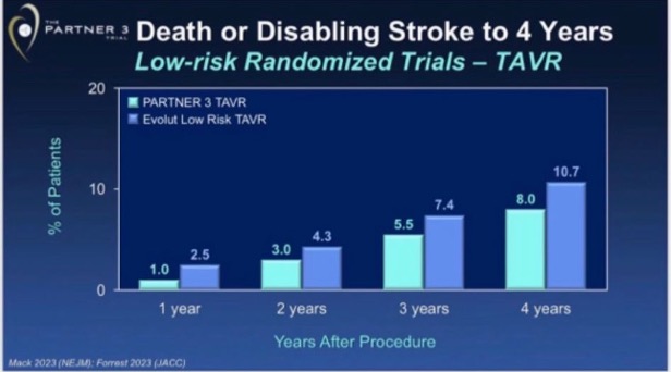
What are these graphs trying to show or conclude? We debated this, and then I shared it with other TAVR friends. Interpretations were not consistent. After a quick assessment one may conclude: ¨Well, having surgery in Evolut LR centers looks the worst option, and PARTNER surgery and TAVR look better than Evolut LR TAVR¨ or ¨Evolut LR TAVR likely inferior to PARTNER TAVR¨. Now the question: are these interpretations the correct ones?
This commentary has two sections: The first one is an overall research methods discussion, which you may skip if you are in a hurry, and the second is my interpretation of these graphs.
Disclosures: This is not a commentary to attack any prosthesis or technology, indeed in my opinion both trials give positive longer-term data for each one. Have no TAVR assets, and I do not own companies that manufacture or distribute TAVR prostheses. I do TAVR proctoring for both balloon- and self-expanding TAVR.
First section: Methods discussion, if interested in diving deep
Why the ¨C¨ of RCT is important.
Everyone acknowledges the meaning of ¨R¨ in the RCT acronym (Randomized Controlled Trial), R = Randomization = treatment assigned by chance or at random. However, the ¨C¨ which means ¨Controlled¨ is a word that not everyone fully incorporates its importance. Controlled means that the experimental group has also a control group. Why a control group is so important?
To know if a treatment works or not and its magnitude, we must have a control group. For instance, a case series (ie, an imaginary 20-year super complete report with the first 1.000.000 people treated with TAVR) without a control group is incapable of estimating risk or benefits relative to other therapeutic options (like doing nothing among inoperable patients or SAVR in operable ones), no matter how large the case series is. Ideally, the control group should come from a randomized trial. When control groups are drawn from any other settings (like in the slide above, comparing different trials), then we will inevitably introduce some degree of confounding bias (the observed beneficial or detrimental effect is explained by an imbalance in baseline variables) and other biases.
In other words: A properly executed randomization process will guarantee that both treatment and control groups have a balanced or ¨equal¨ chance to develop the outcomes of interest (also called ¨prognostic balance¨). So, any difference observed during follow-up between the treatment and control arm can be assigned to A) ¨true treatment effect¨, B) ¨random error¨ (not addressed today), or C) ¨other biases¨ related to RCTs (like cross-overs, lost to follow-up, etc, not addressed today either!).
Differences in properly executed RCTs will not be attributed to confounding bias because all baseline variables (whether known or unknown) should be balanced when the trial starts.
If the prognostic balance is not achieved at enrollment, because the randomization process is grossly flawed in an RCT (happened, not necessarily in purpose) or it’s an observational analysis, this is how follow-up would look like (assuming there is no treatment effect, just natural evolution of two groups not achieving prognostic balance):

This may look very familiar to you because every observational study showing differences in event rate during follow-up looks like this (ie, PCI ¨diabetes vs no diabetes¨, ¨high SYNTAX score vs low SYNTAX score¨, ¨severe vs non-severe LVEF¨, or any other study showing different prognosis between the alternative status of baseline variables).
Relative differences vs absolute differences make a difference!
Let’s focus on scenario A, ¨in this RCT any observed difference during the trial is due to the true treatment effect¨. That means: If treatment looks better relative to the control group, treatment is beneficial. If treatment looks worse relative to the control group, treatment is detrimental. Treatment looks like the control group, treatment is ¨similar¨.
You will notice that we are looking at ¨relative differences¨ between treatment arm vs control group. That’s why most RCTs present their results on relative treatment effects (like Hazzard Ratio, Odds Ratio, and Relative Risk) with wording like Relative Risk = 0.8 followed by ¨we observed a 20% relative risk reduction in X outcome¨.
So, what about absolute risk differences? Absolute risk difference is of key importance for clinical decision-making (even more important than relative risk differences when making real-world clinical decisions with patients). Treatment can reduce the absolute risk of death from 20% to 10% (RR 0.5, RRR 50%, NNT 10) and be very attractive, while other treatments can reduce from 1% to 0.5% (also RR 0.5 and RRR 50%, but NNT 200) and not be very attractive despite same relative risk reduction.
However, the most important product of an RCT is the relative effect estimates, while the absolute risk estimates are subject to the ¨baseline control group risk¨ of those included in the actual study. Why?
We are all familiar with the critique of RCTs: ¨this is a very selected population¨, ¨the observed outcomes happened less frequently than expected¨, or ¨the patients from real practice have higher risk¨. All of them are usually true. Patients from RCTs systematically have lower risk than real-life ones, mostly due to inclusion or exclusion criteria, and access to a center of excellence permitting them to be enrolled in the first place, among other factors. Then, the control group risk in RCTs is typically lower than in real-world ones. Note: excepted those outcomes that are likely to be underreported in medical records and RCTs can measure them dedicately.
Relative risk stays constant across different baseline risks
In general, relative risk stays constant across different baseline risks. That’s why we expect similar relative risk reduction across trials about the same topic or research question, but not necessarily the same absolute risk reduction. This is why we assess heterogeneity across studies (how much the result varies across selected studies) using relative risk, rather than absolute risk. Studies can find different absolute differences and that’s okay since it may be due to different control group baseline risks, but very different relative risks are suspicious of heterogeneity in study results.
For example: for the same relative risk reduction (ie, 20%), if the baseline risk of one study has a control group happening in 10%, 20% less means that the intervention group event rate will be closely reduced to 8% (absolute risk difference 2%). This is different from a study with a 5% control event rate which a 20% relative risk reduction would lead to a 1% absolute risk reduction (20% less than 5% is 4% in the intervention group). You will notice that a 1% absolute risk reduction vs 2% in the prior example is a half! Despite that, the studies have the same relative risk reduction of 20%, so similar effects.
How do we integrate relative and absolute risks to generate a recommendation?
Earlier we stated that patients care more about absolute than relative risk reductions. So, which one to use, relative or absolute risk? For trustworthy high-quality clinical guideline recommendations, we pool (meta-analysis) all the best available information from (ideally RCTs) to generate a single relative risk estimate for each important outcome. Then that relative risk is applied to the expected baseline (absolute) risk in the population and gets an absolute risk reduction in the treatment group. The latter is used to assess the magnitude of the effect.
Application in practice: let’s assume that meta-analysis shows a relative risk of 0.80 for a 30-day stroke. That relative risk reduction (20%) is applied to our best estimate of control group risk in that population to which the guideline is going to be applied. If the risk of a 30-day stroke in SAVR is 5%, then TAVR would be 20% relative less, that is 4%. In absolute terms, 5% – 4% = 1% expected absolute risk reduction, expected NNT = 100 people.
Ideally, the control group risk (in this case an imaginary 5% for 30-day stroke risk in SAVR) should come from observational or “real-world” information. However, sometimes this information is not available, not reliable, or representative. In those scenarios is common to keep the control group risk from RCTs but acknowledging that we may be underestimating the benefit, since real-world settings usually exhibit higher risk than patients participating in RCTs.
Second section: How should we interpret this graph from TCT 2023?
Evolut LR TAVR risk seems lower than its control, but higher than both PARTNER TAVR and SAVR study arms. These four Kaplan-Meier curves come from two different trials, which of course are at risk of having some degree of different control group risk.
A similar description of baseline variables does not help much
Authors of this analysis show a table with baseline variables pointing that Evolut LR and PARTNER included similar populations, highlighting in yellow key ones that are surprisingly similar:
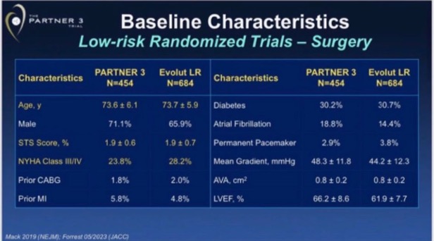
Is this table evidence that both trials had a similar ¨prognostic balance¨? Well, of course, Table 1 showing gross differences (ie, 10-year mean difference in age, or 20% more diabetics, which is not the case) would be evidence that groups were very different. However, a table showing seemingly similar prevalence of demographics and comorbidities does not guarantee (by any means) sufficient prognostic balance to assume that observed differences belong to real treatment differences (this is the reason why we need some ¨Simple, large randomized clinical trials¨, confounding usually outweighs moderate treatment effects). A great example of this is propensity score studies: they produce RCT-like balance in Table 1, but they commonly are no better (and sometimes perform worse) than the popular multivariable analysis.
Then, why Evolut LR trial SAVR group have a higher risk than the PARTNER SAVR group?
We can explain this with multiple hypotheses. One simple and plausible hypothesis is that, despite we are talking about the same population title (low-risk TAVR candidates) in both trials, aspects related to different aspects like inclusion and exclusion criteria, protocol, and enrolling centers (and others) may have a subtle impact on prognosis. This happens all the time across all medical specialties: baseline risks usually are not identical and that’s ok.
Another hypothesis that caught my eye reading opinions about this: ¨surgical results were worse in Evolut LR trial¨. How can we tell if the differences in a 4-year survival curve are related to poorer surgical results (in this case Evolut LR centers are blamed for having poorer surgical results than PARTNER 3) or just different baseline risks (selection bias, different life expectancy in those enrolled between PARTNER 3 and Evolut LR trials)? Let’s do an exercise.
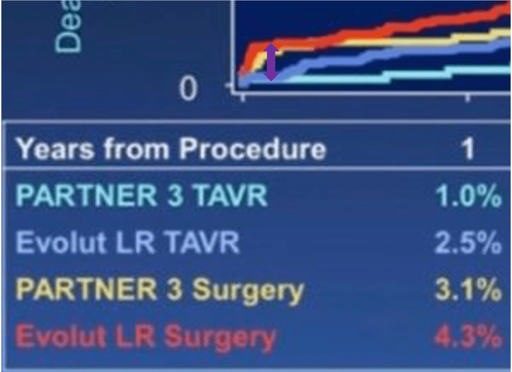
If just perioperative SAVR results explain a 4-year difference, then perioperative death and stroke should be markedly different at 30 days between Evolut LR and PARTNER 3 trials, and then curves would remain pretty parallel. If just the difference in baseline risk explains the observed 4-year difference, then both SAVR arms would look similar at 30 days and then curves will diverge as time goes by (remember the graph I showed before between red and green lines).
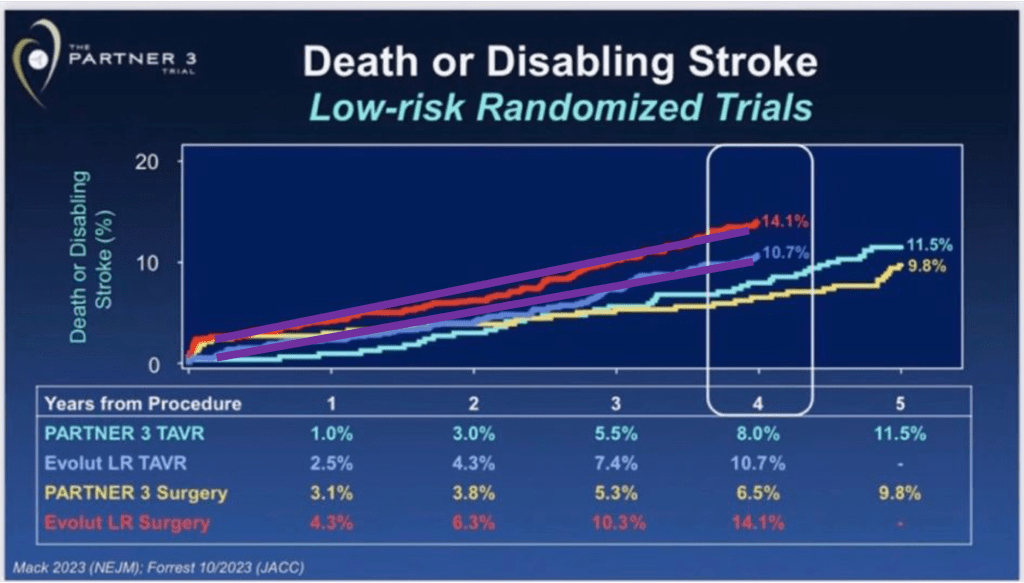
Now let’s re-look the survival curves and you will notice on your own which of the two scenarios is the more likely to be true:
Both SAVR 30-day outcomes are within the purple circle:

Long-term steepness of both SAVR arms in purple lines:

Unless you have strong prior beliefs (due or not due to conflict of interests), you will probably reach the same conclusion as anyone looking at this slide: 30-day outcomes in the control group (SAVR of both Evolut LR and PARTNER 3) don’t look very different to explain 4-years differences. They look similar in perioperatively and diverge over time. This is more consistent with the hypothesis that observed long-term differences of SAVR between Evolut LR and PARTNER 3 are due to differences in baseline risks (or selection bias: population enrolled in Evolut LR had a higher risk of having outcomes, from the moment they were enrolled). No need to blame surgical teams I guess.
Another indirect observation to validate this reasoning is the following (graphs below). We probably agree that TAVR is superior to SAVR in the short term, less invasive, like a PCI vs CABG scenario. If you do the same exercise we just did (compare 30-days vs curve steepness in the longer term) between Evolut LR SAVR vs TAVR arm, you will notice that perioperatively TAVR is markedly superior to SAVR (no surprise) but then the steepness of the curves during follow-up remains parallel over time, that is: same baseline risk, no selection bias. By default, since these two arms were randomized between them, there is no selection bias between study arms: no confounding bias.
Evolut LR SAVR vs TAVR arms at 30-days, difference in purple:
Evolut LR SAVR vs TAVR arms at 4-years, in purple lines:
One may argue that if your surgical results are bad, they can influence the divergence of curves in the long term. This argument, although binarily speaking (yes vs no) is true, how likely, or plausible is it that a poor surgical result has little or no impact in perioperative events but then a marked influence in the steepness of risk during long-term follow-up? Very unlikely.
Blaming the surgeons is the short and likely wrong explanation
Our brains are naturally designed to find patterns or associations (patternicity) and do not like ambiguity or leaving aspects without explanation, so we often keep simple but wrong explanations for complex observations. Sometimes it’s simpler to blame big companies’ interests for financial crises, instead of understanding and contemplating the complexity of the market. Same here: blaming surgical results is the short and likely wrong answer, based on the explanations above.
Misleading graph or misleading interpretation?
Guns don’t kill people, people kill people.
Nothing to to with gun control propaganda, however this is a fact still and applies here as well
Graphs themselves, no matter what you put into them, are just data. There is nothing against data whatever format. The problem is how we interpret the conclusions we disseminate. In this case, mixing two randomized trials and comparing them using absolute risk differences is no better than comparing two observational cohorts, with all inherent confounding biases you can imagine between cohorts. Then, no strong conclusions can be drawn.
Indeed, in relative terms, self-expanding TAVR may look like a better option, since it seems to have a better performance relative to its control group. Now you probably understand why I dedicated several paragraphs to explain why estimates relative to the control group are the most important comparison.
Regardless, I believe that both trials provide new positive data for each prosthesis. Of course, there are differences between Evolut and Sapien, like different SAVR prosthesis (Mosaic vs Mitroflow, vs Epic). But TAVR prosthesis share most advantages vs SAVR (less invasive, less morbid, shorter hospitalization, etc). Would interpret this more like Evolut + Sapien data (accumulating longer-term TAVR evidence vs its control group, SAVR) rather than Evolut vs Sapien contest.
What are the next steps? To me, a high-quality updated network meta-analysis (which is underway) focusing on clinical outcomes is needed to better understand this topic. Direct comparisons between TAVR platforms represent an underpowered minority of studies, so most of the evidence will come from indirect evidence for TAVR vs TAVR comparisons with its limitations. Still, that would be our best guess using the state-of-the-art methods we have. Needless to say, more direct comparisons between TAVR platforms and longer follow-ups are key as well.
Hope you enjoyed and learned something new!
Do not hesitate to comment on social media thoughts and feedback of any kind.
Pablo Lamelas MD MSc
Assitant Professor at Health Research Methods, Evidence, and Impact, McMaster Univeristy, Canada. Part-time.
